记录用过的控件的用法,不定期更新.
TextView
<TextView
        android:text=""          //显示的文字
        android:textColor=""     //文字的颜色
        android:textSize="15sp" //文字的大小 推荐用 sp做单位
        android:gravity=""      //文字的位置
        android:layout_width="match_parent"
        android:textStyle=""            //设置字体风格,三个可选值:normal(无效果),bold(加粗),italic(斜体)
          />
- 设置省略号
android:ellipsize="start"        省略号在开头
android:ellipsize="middle"       省略号在中间
android:ellipsize="end"          省略号在结尾
android:ellipsize="marquee"      跑马灯显示
- 字间和行距
android:textScaleX:控制字体水平方向的缩放,默认值1.0f,值是float
android:lineSpacingExtra:设置行间距,如"3dp"
android:lineSpacingMultiplier:设置行间距的倍数,如"1.2"
Button
android:drawableLeft = ""//同时使用文本和图标
android:textAllCaps="false" //取消字母大写
ImageButton
<ImageButton
    android:layout_width="wrap_content"
    android:layout_height="wrap_content"
    android:src="@drawable/button_icon"
    ... />
EditText
<EditText
    android:id="@+id/edit"
    android:hint=""     //给出一段提示性文字
    android:layout_width="match_parent"
    android:layout_height="wrap_content"
    android:maxLines="2" //指定输入文字的最大行数
 />
EditText edit=(EditText)findViewById(R.id.edit);
- 取消下划线
android:background="@null"
- 取消光标
android:cursorVisible="false"
- 设置EditText光标颜色及粗细
//在drawable文件中创建 shape文件
<shape xmlns:android="http://schemas.android.com/apk/res/android">
    <size android:width="2dp"/>
    <solid android:color="#58b1fc"/>
</shape>
然后在 android:textCursorDrawable="" 中引用
改变键盘中的下一行为搜索
添加android:imeOptions="actionSearch"属性,通过下面代码进行监听:
editText.setOnEditorActionListener(new TextView.OnEditorActionListener() {
            @Override
            public boolean onEditorAction(TextView v, int actionId, KeyEvent event) {
                if (actionId == EditorInfo.IME_ACTION_SEARCH || actionId == EditorInfo.IME_ACTION_UNSPECIFIED){
                    // 先隐藏键盘
                    ((InputMethodManager) getSystemService(INPUT_METHOD_SERVICE))
                            .hideSoftInputFromWindow(SearchActivity.this.getCurrentFocus()
                                    .getWindowToken(), InputMethodManager.HIDE_NOT_ALWAYS);
                    //进行搜索操作的方法,在该方法中可以加入mEditSearchUser的非空判断
                    .....
                    return true;
                }
                return false;
            }
        });
- 单行
android:singeLine=”true”
- 设置内容
setText(content);//设置EditText控件的内容 setSelection(content.length());//将光标移至文字末尾
ImageView
- 简单使用
注意:图片一般不放在自动生成的drawable文件中,而是我们自己新建一个 drawable-xhdpi 目录,把图片放在其中
<ImageView
    android:src="@drawable/edit"   //引用图片
    android:layout_width="wrap_content"
    android:layout_height="wrap_content" />
ImageView默认的ScaleType
属性介绍
- matrix:不缩放 ,图片与控件 左上角 对齐,当图片大小超过控件时将被 裁剪
- center:不缩放 ,图片与控件 中心点 对齐,当图片大小超过控件时将被 裁剪
- centerInside:以完整显示图片为目标, 不剪裁 ,当显示不下的时候将缩放,能够显示的情况下不缩放**
- centerCrop:以填满整个控件为目标,等比缩放,超过控件时将被 裁剪 ( 宽高都要填满 ,所以只要图片宽高比与控件宽高比不同时,一定会被剪裁)
- fitCenter(默认):自适应控件, 不剪裁 ,在不超过控件的前提下,等比 缩放 到 最大 ,居中显示
- fitStart:自适应控件, 不剪裁 ,在不超过控件的前提下,等比 缩放 到 最大 ,靠左(上)显示
- fitEnd:自适应控件, 不剪裁 ,在不超过控件的前提下,等比 缩放 到 最大 ,靠右(下)显示
- fitXY:以填满整个控件为目标, 不按比例 拉伸或缩放(可能会变形), 不剪裁。
原文链接:blog.csdn.net/yulyu/artic…
ProgressBar
- 简单使用
<ProgressBar
        android:max="100" //给进度条设置一个最大值
        style="?android:attr/progressBarStyleHorizontal" //这里指定为水平进度条,默认为圆形
        android:visibility="visible"                     //设置view的可进性
        android:layout_width="wrap_content"
        android:layout_height="wrap_content" />
VISIBLE:设置控件可见 INVISIBLE:设置控件不可见,不占据位置 GONE:设置控件隐藏,仍然占据位置
NumberPicker
参考:www.jianshu.com/p/104299570…
布局文件
 <NumberPicker
    android:id="@+id/number"
    android:solidColor="@color/bar_day" //设置背景颜色
    android:theme="@style/NumberPicker" //设置主题,只能在主题中更改字体颜色和色彩,实测无效
    android:layout_width="match_parent"
    android:layout_height="wrap_content"
    />
代码
numberPicker=(NumberPicker)findViewById(R.id.number);
        numberPicker.setMinValue(0); //设置最小值
        numberPicker.setMaxValue(3); //设置最大值
        //设置监听
        numberPicker.setOnValueChangedListener(new NumberPicker.OnValueChangeListener() {
            @Override
            public void onValueChange(NumberPicker picker, int oldVal, int newVal) {
                Log.d("=================","old="+oldVal+"  ,new="+newVal);
            }
        });
        //设置具体的字符串的值,注意数组的大小必须为 (max-min+1)
        numberPicker.setDisplayedValues(new String[]{"aaa","bbb","ccc","ddd"});
        //设置格式,注意:如果还调用上面的 setDisplayedValues,以setDisplayedValues的值为准
        numberPicker.setFormatter(new NumberPicker.Formatter() {
            @Override
            public String format(int value) {
                return "哈哈"+value;
            }
        });
numberPicker.setValue(1);//设置出现的值,最好调用这个方法,不然刚开始的时候不会格式化值
设置字体的颜色和大小
//继承NumberPicker来更改字体的颜色
public class MyNumberPicker extends NumberPicker {
    public MyNumberPicker(Context context) {
        super(context);
    }

    public MyNumberPicker(Context context, AttributeSet attrs) {
        super(context, attrs);
    }

    public MyNumberPicker(Context context, AttributeSet attrs, int defStyleAttr) {
        super(context, attrs, defStyleAttr);
    }

    @Override
    public void addView(View child) {
        super.addView(child);
        updateView(child);
    }

    @Override
    public void addView(View child, ViewGroup.LayoutParams params) {
        super.addView(child, params);
        updateView(child);
    }

    @Override
    public void addView(View child, int index, ViewGroup.LayoutParams params) {
        super.addView(child, index, params);
        updateView(child);
    }

    private void updateView(View view) {
        if (view instanceof EditText) {
            //设置文字的颜色和大小
            ((EditText) view).setTextColor(Color.parseColor("#6d83ee"));
            //((EditText) view).setTextSize(16);
        }
    }

}
设置分割线颜色
 /**
     * 通过反射更改NumberPicker的分割线颜色
     * @param picker
     * @throws NoSuchFieldException
     * @throws IllegalAccessException
     */
  private void changeDividerColor(NumberPicker picker) throws NoSuchFieldException, IllegalAccessException {
      Field field = NumberPicker.class.getDeclaredField("mSelectionDivider");
      if (field != null) {
          field.setAccessible(true);
          field.set(picker, new ColorDrawable(Color.parseColor("#edf6fd")));
      }
  }
设置NumberPicker不能被编辑
//设置不可编辑
        numberPicker.setDescendantFocusability(NumberPicker.FOCUS_BLOCK_DESCENDANTS);
TimePicker
- 简单使用
布局文件
<TimePicker
        android:id="@+id/time"
        android:timePickerMode="clock" //这个在Api21上才有,设置模式:spinner clock(默认),api21以前只有 spinner
        android:layout_width="match_parent"
        android:layout_height="wrap_content"
         />
代码
 timePicker=(TimePicker)findViewById(R.id.time);
        timePicker.setIs24HourView(true);//true 24时制 false 12时制
        timePicker.getHour();//api23以上
        timePicker.getCurrentHour();//api23以下
        //监听器
        timePicker.setOnTimeChangedListener(new TimePicker.OnTimeChangedListener() {
            @Override
            public void onTimeChanged(TimePicker view, int hourOfDay, int minute) {
                Log.d("==============","hour="+hourOfDay+"  minute="+minute);
            }
        });
DataPicker
布局文件
<DatePicker
        android:id="@+id/date"
        android:layout_width="match_parent"
        android:layout_height="wrap_content"/>
代码
 datePicker=(DatePicker)findViewById(R.id.date);
        //设置监听,api26以上
        datePicker.setOnDateChangedListener(new DatePicker.OnDateChangedListener() {
            @Override
            public void onDateChanged(DatePicker view, int year, int monthOfYear, int dayOfMonth) {
                Log.d("==========","year="+year+"  month="+monthOfYear+"  day="+dayOfMonth);
            }
        });
TableLayout
- 简单使用
布局文件
<TableLayout
        android:layout_width="match_parent"
        android:layout_height="match_parent"
        android:collapseColumns=""  //设置需要被隐藏的列的序号
        android:shrinkColumns=""    //设置允许被收缩的列的列序号
        android:stretchColumns=""   //设置运行被拉伸的列的列序号
        >
        <TableRow>  //表示一行里有多少个列
            <Button android:layout_weight="1"/>
            <Button android:layout_weight="1"/>
        </TableRow>
    </TableLayout>
ListView
- 布局文件
<ListView
        android:id="@+id/list"
        android:layout_width="match_parent"
        android:layout_height="match_parent"/>
每一项的布局文件
<?xml version="1.0" encoding="utf-8"?>
<LinearLayout xmlns:android="http://schemas.android.com/apk/res/android"
    android:layout_width="match_parent"
    android:layout_height="match_parent">
<ImageView
    android:id="@+id/icon"
    android:layout_width="wrap_content"
    android:layout_height="match_parent" />

    <TextView
        android:id="@+id/content"
        android:layout_width="wrap_content"
        android:layout_height="match_parent" />
</LinearLayout>
适配器
public class MyDataAdapter extends ArrayAdapter<Data> {

    private int id;//布局的id
    private List<Data> list;//数据

    public MyDataAdapter(@NonNull Context context, int resource, @NonNull List<Data> objects) {
        super(context, resource, objects);
        this.id=resource;
        this.list=objects;
    }

    @NonNull
    @Override
    public View getView(int position, @Nullable View convertView, @NonNull ViewGroup parent) {
        View view=null;
        ViewHolder holder=null;
        if (convertView==null){
            view= LayoutInflater.from(getContext()).inflate(id,parent,false);
            holder=new ViewHolder();
            holder.content=(TextView)view.findViewById(R.id.content);
            holder.icon=(ImageView)view.findViewById(R.id.icon);
            view.setTag(holder);
        }else{//对convertView进行重用,提高性能
            view=convertView;
            holder=(ViewHolder)view.getTag();
        }
        //设置数据
        holder.content.setText(list.get(position).getTitle());
        holder.icon.setImageResource(list.get(position).getId());

        return view;
    }
    //通过ViewHolder缓存所有的控件实例
    class ViewHolder{
       ImageView icon;

       TextView content;
    }

}
注意,ListView有很多适配器,常用
ArrayAdapter<T>
Checkboxes
复选框允许用户从集合中选择一个或多个选项
<?xml version="1.0" encoding="utf-8"?>
<LinearLayout xmlns:android="http://schemas.android.com/apk/res/android"
    android:orientation="vertical"
    android:layout_width="fill_parent"
    android:layout_height="fill_parent">
    <CheckBox android:id="@+id/checkbox_meat"
        android:layout_width="wrap_content"
        android:layout_height="wrap_content"
        android:text="@string/meat"
        android:onClick="onCheckboxClicked"/>
    <CheckBox android:id="@+id/checkbox_cheese"
        android:layout_width="wrap_content"
        android:layout_height="wrap_content"
        android:text="@string/cheese"
        android:onClick="onCheckboxClicked"/>
</LinearLayout>
代码
public void onCheckboxClicked(View view) {
    //获取复选框的状态
    boolean checked = ((CheckBox) view).isChecked();

    switch(view.getId()) {
        case R.id.checkbox_meat:
            if (checked)//被选中

            else

            break;
        case R.id.checkbox_cheese:
            if (checked)

            else

            break;

    }
}
注意:响应的方法必须是
public,无返回值类型,参数只有一个必须是View view
RadioButton和RadioGroup
<RadioGroup
        android:id="@+id/all"
        android:layout_width="match_parent"
        android:layout_height="50dp"
        android:orientation="horizontal"
        android:layout_gravity="bottom"
        >
        <RadioButton
            android:drawableTop="@drawable/my_class"
            android:checked="true"
            android:id="@+id/my_class"
            android:layout_weight="1"
            android:layout_width="0dp"
            android:layout_height="wrap_content"
            android:gravity="center"
            android:button="@null"
            android:layout_marginBottom="0dp"
            android:background="@null"//隐藏自带的图案
            />
        <RadioButton
            android:id="@+id/question"
            android:drawableTop="@drawable/question"
            android:layout_weight="1"
            android:gravity="center"
            android:layout_width="0dp"
            android:layout_height="wrap_content"
            android:button="@null"
            android:layout_marginBottom="0dp"
            />
    </RadioGroup>
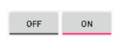
ToggleButton
切换按钮
<ToggleButton
        android:id="@+id/toggleButton"
        android:disabledAlpha="0.5" //设置按钮在禁用时的透明度,默认是0.5
        android:textOn="开" //按钮被选中时显示的文字
        android:textOff="关"//按钮没有被选中时显示的文字
        ...
        />
设置监听
ToggleButton toggle = (ToggleButton) findViewById(R.id.togglebutton);
toggle.setOnCheckedChangeListener(new CompoundButton.OnCheckedChangeListener() {
    public void onCheckedChanged(CompoundButton buttonView, boolean isChecked) {
        if (isChecked) {

        } else {

        }
    }
});
效果如图
Switch
<Switch
        android:layout_marginTop="10dp"
        android:layout_below="@+id/switch_tv"
        android:id="@+id/switch1"
        android:typeface="normal"
        android:textOff="开"
        android:textOn="关"
        android:switchMinWidth="40dp"
        android:switchPadding="10dp"
        android:layout_width="wrap_content"
        android:layout_height="wrap_content" />
常用属性
 android:typeface="normal":设置字体类型
    android:track="":设置开关的轨迹图片
    android:textOff="开":设置开关checked的文字
    android:textOn="关":设置开关关闭时的文字
    android:thumb="":设置开关的图片
    android:switchMinWidth="":开关最小宽度
    android:switchPadding="":设置开关 与文字的空白距离
    android:switchTextAppearance="":设置文本的风格
    android:checked="":设置初始选中状态
    android:splitTrack="true":是否设置一个间隙,让滑块与底部图片分隔(API 21及以上)
    android:showText="true":设置是否显示开关上的文字(API 21及以上)
自定义使用:www.jianshu.com/p/4e436300f…
Spinner
<Spinner
    android:id="@+id/planets_spinner"
    android:layout_width="wrap_content"
    android:layout_height="wrap_content" />
填充数据
通过数组获取则通过 ArrayAdapter来提供,如果选择可通过数据库查询获取,则通过 CursorAdapter 来提供
例如这里通过字符串资源文件R.array.planets_array获取
<?xml version="1.0" encoding="utf-8"?>
<resources>
    <string-array name="planets_array">
        <item>Mercury</item>
        <item>Venus</item>
        <item>Earth</item>
        <item>Mars</item>
        <item>Jupiter</item>
        <item>Saturn</item>
        <item>Uranus</item>
        <item>Neptune</item>
    </string-array>
</resources>
代码
Spinner spinner = (Spinner) findViewById(R.id.spinner);

ArrayAdapter<CharSequence> adapter = ArrayAdapter.createFromResource(this,
        R.array.planets_array, android.R.layout.simple_spinner_item);
// android.R.layout.simple_spinner_item是系统默认布局,用于已选中时的布局
adapter.setDropDownViewResource(android.R.layout.simple_spinner_dropdown_item);
//android.R.layout.simple_spinner_dropdown_item是系统默认布局,用于下拉时的布局
spinner.setAdapter(adapter);
监听事件
public class SpinnerActivity extends Activity implements OnItemSelectedListener {
    ...

    public void onItemSelected ( AdapterView <?> parent , View view ,
            int pos , long id ) {
        //选择了一个项目可以使用检索所选项目 parent.getItemAtPosition(pos)
    }

    public void onNothingSelected ( AdapterView <?> parent ) {
        //另一个接口回调
    }
}
提示
工具提示是当用户长按视图或将鼠标悬停在视图上时出现在视图附近的小描述性消息(Android 8.0(API级别26)及更高版)
//代码
view.setTooltipText("");

//布局
<view
android:tooltipText=""
/>
ScrollView
垂直滚动控件。水平滚动控件用
HorizontalScrollView。ScrollView只能包含一个子视图或视图组,在实际项目中,通常包含的是一个垂直的LinearLayout
<?xml version="1.0" encoding="utf-8"?>
<ScrollView xmlns:android="http://schemas.android.com/apk/res/android"
    xmlns:app="http://schemas.android.com/apk/res-auto"
    xmlns:tools="http://schemas.android.com/tools"
    android:layout_width="match_parent"
    android:layout_height="match_parent"
    tools:context=".baseWidget.BaseWidgetActivity">
<LinearLayout
    android:layout_width="match_parent"
    android:layout_height="wrap_content"
    android:orientation="vertical"
    >
    <Button
        android:layout_width="match_parent"
        android:layout_height="300dp" />
    <Button
        android:layout_width="match_parent"
        android:layout_height="300dp" />
    <Button
        android:layout_width="match_parent"
        android:layout_height="300dp" />
    <Button
        android:layout_width="match_parent"
        android:layout_height="300dp" />
    <Button
        android:layout_width="match_parent"
        android:layout_height="300dp" />
</LinearLayout>
</ScrollView>
MultiAutoCompleteTextView
支持连续提示。即第一次点击提示信息后,会自动在后面添加分隔符(默认为逗号,并加上空格),然后又可以继续显示提示信息。
布局文件
 <MultiAutoCompleteTextView
        android:id="@+id/multiAutoCompleteTextView"
        android:layout_width="wrap_content"
        android:layout_height="wrap_content"
        android:minWidth="100dp"
        />
代码
multiAutoCompleteTextView=(MultiAutoCompleteTextView)findViewById(R.id.multiAutoCompleteTextView);
        ArrayAdapter<String> adapter=new ArrayAdapter<>(this,
                android.R.layout.simple_dropdown_item_1line,//使用默认的布局
                new String[]{"new","class","name"});
        //设置分词器,默认为逗号+空格
        multiAutoCompleteTextView.setTokenizer(new MultiAutoCompleteTextView.CommaTokenizer());
        multiAutoCompleteTextView.setAdapter(adapter);
AutoCompleteTextView
实现自动提示的控件
布局文件
<AutoCompleteTextView
        android:id="@+id/autoCompleteTextView"
        android:layout_width="wrap_content"
        android:layout_height="wrap_content"
        android:completionThreshold="1"
        android:minWidth="100dp"
       />
代码
       autoCompleteTextView=(AutoCompleteTextView)findViewById(R.id.autoCompleteTextView);
        ArrayAdapter<String> adapter=new ArrayAdapter<>(this,
                android.R.layout.simple_dropdown_item_1line,//使用默认的布局
                new String[]{"abc","mvp","happy"});
        autoCompleteTextView.setAdapter(adapter);
常见属性
| 属性 | 描述 |
|---|---|
android:completionHint |
设置出现在下拉菜单底部的提示信息 |
android:completionThreshold |
设置触发补全提示信息的字符个数 |
android:dropDownHorizontalOffset |
设置下拉菜单于文本框之间的水平偏移量 |
android:dropDownHeight |
设置下拉菜单的高度 |
android:dropDownWidth |
设置下拉菜单的宽度 |
android:singleLine |
设置单行显示文本内容 |
android:dropDownVerticalOffset |
设置下拉菜单于文本框之间的垂直偏移量 |
CheckedTextView
CheckedTextView 类似checkbox,单选-多选,但它支持文字
布局文件
//复选
<CheckedTextView
        android:id="@+id/checkedTextView"
        android:layout_width="wrap_content"
        android:layout_height="wrap_content"
        android:checkMark="?android:attr/listChoiceIndicatorMultiple"
/>

//单选
<CheckedTextView
        android:id="@+id/checkedTextView"
        android:layout_width="wrap_content"
        android:layout_height="wrap_content"
        android:checkMark="?android:attr/listChoiceIndicatorSingle"
/>

//如果不指定 checkMark属性就不会出现选择框
代码
checkedTextView=(CheckedTextView)findViewById(R.id.checkedTextView);
        checkedTextView.setChecked(true);
        checkedTextView.setOnClickListener(v -> {
            checkedTextView.toggle();//切换
            Log.d("===============",checkedTextView.isChecked()+"");
        });
DrawerLayout
滑动菜单
- 在布局文件中设置
<android.support.v4.widget.DrawerLayout
    xmlns:android="http://schemas.android.com/apk/res/android"
    xmlns:app="http://schemas.android.com/apk/res-auto"
    xmlns:tools="http://schemas.android.com/tools"
    android:layout_width="match_parent"
    android:layout_height="match_parent"
    tools:context="com.example.demo.designActivity"
    android:id="@+id/drawer"
    >

<FrameLayout    //这里作为主菜单的内容
    android:layout_width="match_parent"
    android:layout_height="match_parent">
</FrameLayout>

<TextView    //滑动菜单的内容
        android:layout_gravity="start"  //这个属性是必需的,指定滑动菜单从哪里滑出
        android:layout_width="match_parent"
        android:layout_height="match_parent" />
</android.support.v4.widget.DrawerLayout>
- 设置点击事件
        drawerLayout.addDrawerListener(new DrawerLayout.DrawerListener() {
            //当Drawer的位置改变时调用
            @Override
            public void onDrawerSlide(@NonNull View drawerView, float slideOffset) {

            }
            //当Drawer处于完全打开状态时调用
            @Override
            public void onDrawerOpened(@NonNull View drawerView) {

            }
            //当Drawer处于完全关闭状态时调用
            @Override
            public void onDrawerClosed(@NonNull View drawerView) {

            }
            //当抽屉运动状态改变时调用。newState将是其中之一STATE_IDLE,STATE_DRAGGING或STATE_SETTLING。
            //STATE_DRAGGING 表示用户当前正在拖动抽屉。
            //STATE_IDLE
            //表示任何抽屉处于空闲,已结算状态。没有动画正在进行中
            //STATE_SETTLING
            //表示抽屉正处于最终位置
            @Override
            public void onDrawerStateChanged(int newState) {

            }
        });
通过使用 ActionBarDrawerToggle 类的实例替代 DrawerLayout.DrawerListener 回调方法来实现 更改标题和移除与主内容有关的操作,有自带的动画效果
 ActionBarDrawerToggle actionBarDrawerToggle=
                new ActionBarDrawerToggle(this,drawerLayout,toolbar,R.string.open,R.string.close){
                    //后面两个参数是启动辅助功能时才有效果,一般不用考虑
                    @Override
                    public void onDrawerOpened(View drawerView) {
                        super.onDrawerOpened(drawerView);
                       //drawerView是侧滑显示的View
                    }
                };
        //实现toolbar和Drawer的联动
        actionBarDrawerToggle.syncState();
        drawerLayout.addDrawerListener(actionBarDrawerToggle);
可以手动滑出,也可以通过 drawerLayout.openDrawer(Gravity.START); 方法滑出
- 要使滑动菜单页不遮挡Toolbar布局文件应改为
<LinearLayout xmlns:android="http://schemas.android.com/apk/res/android"
    xmlns:app="http://schemas.android.com/apk/res-auto"
    xmlns:tools="http://schemas.android.com/tools"
    android:layout_width="match_parent"
    android:layout_height="match_parent"
    tools:context=".navigation.NavigationActivity"
android:orientation="vertical"
    >
    <android.support.v7.widget.Toolbar
        android:id="@+id/toolBar"
        android:layout_width="match_parent"
        android:layout_height="wrap_content"
        android:background="?attr/colorPrimary"
        android:minHeight="?attr/actionBarSize"
        android:popupTheme="@style/ThemeOverlay.AppCompat.Light"
        app:theme="@style/ThemeOverlay.AppCompat.Dark.ActionBar"
        />
<android.support.v4.widget.DrawerLayout
    android:id="@+id/drawer"
    android:layout_width="match_parent"
    android:layout_height="match_parent">
    <FrameLayout
        android:layout_width="match_parent"
        android:layout_height="match_parent">

    </FrameLayout>

    <TextView
        android:text="text"
        android:layout_gravity="start"
        android:layout_width="350dp"
        android:background="@color/colorAccent"
        android:layout_height="match_parent" />
</android.support.v4.widget.DrawerLayout>

</LinearLayout>
NavigationView
可以帮助我们简单实现滑动菜单页
- 创建menu的文件,叫 navi.xml
<?xml version="1.0" encoding="UTF-8" ?>
<menu xmlns:android="http://schemas.android.com/apk/res/android">
    <group    android:checkableBehavior="single">//group表示一个组,single表示单选
        <item android:id="@+id/menu_1" android:title="1"/>
        <item android:id="@+id/menu_2" android:title="2"/>
        <item android:id="@+id/menu_3" android:title="3"/>
    </group>
</menu>
- 创建layout文件,叫 navigation.xml
<?xml version="1.0" encoding="utf-8"?>
<LinearLayout xmlns:android="http://schemas.android.com/apk/res/android"
    android:layout_width="match_parent"
    android:layout_height="match_parent"
    android:orientation="vertical"
    >
  <ImageView
      android:src="@drawable/before"
      android:layout_width="wrap_content"
      android:layout_height="wrap_content" />
    <TextView
        android:text="飞机"
        android:layout_width="wrap_content"
        android:layout_height="wrap_content" />

</LinearLayout>
- activity的布局文件
<?xml version="1.0" encoding="utf-8"?>
<android.support.v4.widget.DrawerLayout
    xmlns:android="http://schemas.android.com/apk/res/android"
    xmlns:app="http://schemas.android.com/apk/res-auto"
    xmlns:tools="http://schemas.android.com/tools"
    android:layout_width="match_parent"
    android:layout_height="match_parent"
    tools:context="com.example.demo.designActivity"
    android:id="@+id/drawer"
    >

<FrameLayout    //这里作为主菜单的内容
    android:layout_width="match_parent"
    android:layout_height="match_parent">
</FrameLayout>

    <android.support.design.widget.NavigationView
        android:id="@+id/navi"
        android:layout_width="match_parent"
        android:layout_height="match_parent"
        android:layout_gravity="start"
        app:menu="@menu/navi"  //设置menu文件
        app:headerLayout="@layout/navigation" //设置layout文件
       />

</android.support.v4.widget.DrawerLayout>
- 设置点击事件
- 设置menu的点击事件
navigationView.setCheckedItem(R.id.menu_1);//设置默认选中的item
navigationView.setNavigationItemSelectedListener(new NavigationView.OnNavigationItemSelectedListener() {
            @Override
            public boolean onNavigationItemSelected(@NonNull MenuItem item) {
                switch (item.getItemId()){
                    case R.id.menu_1:
                        Toast.makeText(designActivity.this, "menu_1", Toast.LENGTH_SHORT).show();
                        break;
                    case R.id.menu_2:
                        Toast.makeText(designActivity.this, "menu_2", Toast.LENGTH_SHORT).show();
                        break;
                    case R.id.menu_3:
                        Toast.makeText(designActivity.this, "menu_3", Toast.LENGTH_SHORT).show();
                        break;
                }
                return false;
            }
        });
- 设置layout的点击事件
for (int i=0;i<navigationView.getHeaderCount();i++) {
            View view=navigationView.getHeaderView(i);
            ImageView imageView=view.findViewById(R.id.image);
            TextView textView=view.findViewById(R.id.flight);
            imageView.setOnClickListener(new View.OnClickListener() {
                @Override
                public void onClick(View v) {

                }
            });

            textView.setOnClickListener(new View.OnClickListener() {
                @Override
                public void onClick(View v) {

                }
            });
        }
FloatingActonButton
布局文件
 <android.support.design.widget.FloatingActionButton
        android:id="@+id/floatingAction"
         android:src="@drawable/edit"
        android:layout_width="wrap_content"
        android:layout_height="wrap_content"
        android:layout_gravity="bottom|end"
        android:layout_marginBottom="15dp"
        app:elevation="8dp"   //设置FloatingActonButton的高度值,高度值越大投影,投影范围越大,投影越淡
        />
其他FAB属性:
FAB的大小,使用app:fabSize属性或setSize()方法。
使用app:rippleColor属性或setRippleColor()方法的FAB的波纹颜色。
FAB图标,使用android:src属性或setImageDrawable()方法。
SnackBar
              //view为任意布局中存在的view,在内部会根据这个view获取它的父布局
 Snackbar.make(view,"内容",Toast.LENGTH_SHORT).setAction("ok", new View.OnClickListener() {
                    @Override
                    public void onClick(View view) {

                    }
                }).show();
CoordinatorLayout
CoordinatorLayout是FrameLayout的子类 CoordinatorLayout可以监听其使用的子类的各种事件,然后自动帮助我们做出最为合理的响应
像上面调用Snackbar把FloatingActonButton遮盖的问题,就可以使用CoordinatorLayout,布局文件如下
<android.support.v4.widget.DrawerLayout
    xmlns:android="http://schemas.android.com/apk/res/android"
    xmlns:app="http://schemas.android.com/apk/res-auto"
    xmlns:tools="http://schemas.android.com/tools"
    android:layout_width="match_parent"
    android:layout_height="match_parent"
    tools:context="com.example.demo.designActivity"
    android:id="@+id/drawer"
    >

    <android.support.design.widget.CoordinatorLayout
        android:layout_width="match_parent"
        android:layout_height="match_parent">

        <android.support.v7.widget.Toolbar
            android:id="@+id/toolBar"
            android:layout_width="match_parent"
            android:layout_height="?attr/actionBarSize">
        </android.support.v7.widget.Toolbar>

      <android.support.design.widget.FloatingActionButton
        android:id="@+id/floatingAction"
        android:layout_width="wrap_content"
        android:layout_height="wrap_content"
        android:layout_gravity="bottom|end"
        android:layout_marginBottom="15dp"
        app:layout_anchor="@id/toolBar"  //设置锚点
        app:layout_anchorGravity="bottom|end" //设置在锚点的位置
        />

    </android.support.design.widget.CoordinatorLayout>

    <android.support.design.widget.NavigationView
        android:id="@+id/navi"
        android:layout_width="match_parent"
        android:layout_height="match_parent"
        android:layout_gravity="start"
        app:menu="@menu/navi"
        app:headerLayout="@layout/navigation"
       />

</android.support.v4.widget.DrawerLayout>
这个虽然Snackbar不是CoordinatorLayout的子控件,但是调用Snackbar时,可以传入一个CoordinatorLayout的子控件的对象进去,从而CoordinatorLayout可以监控到Snackbar
CardView
<android.support.v7.widget.CardView
        android:layout_width="wrap_content"
        android:layout_height="100dp"
        app:cardCornerRadius="4dp"   //设置圆角的半径大小(如果shape没有用的话)
        app:cardElevation="10dp"     //设置CardView的高度值,高度值越大投影,投影范围越大
        android:layout_gravity="center/>
cardView的属性
CardView_cardBackgroundColor:设置背景色 CardView_cardCornerRadius:设置圆角角度大小 CardView_cardElevation:设置z轴阴影大小 CardView_cardMaxElevation:设置z轴最大高度值 CardView_cardUseCompatPadding:是否使用CompadPadding,设置内边距,v21+的版本和之前的版本仍旧具有一样的计算方式 CardView_cardPreventCornerOverlap:是否使用PreventCornerOverlap,在v20和之前的版本中添加内边距,这个属性是为了防止卡片内容和边角的重叠 CardView_contentPadding:内容的padding CardView_contentPaddingLeft:内容的左padding CardView_contentPaddingTop:内容的上padding CardView_contentPaddingRight:内容的右padding CardView_contentPaddingBottom:内容的底padding
使用要添加依赖 implementation 'com.android.support:cardview-v7:27.1.0'
AppBarLayout
用于解决Toolbar在Coordinate中被遮盖的现象,必须是CoordinatorLayout的子布局
- 第一步
把 Toolbar的布局放到 AppBarLayout的布局中
<android.support.design.widget.AppBarLayout
            android:layout_width="match_parent"
            android:layout_height="wrap_content">

            <android.support.v7.widget.Toolbar
                android:id="@+id/toolBar"
                android:layout_width="match_parent"
                android:layout_height="?attr/actionBarSize">
            </android.support.v7.widget.Toolbar>

        </android.support.design.widget.AppBarLayout>
- 第二步
在会遮盖Toolbar的布局(比如一个RecyclerView)中加入 app:layout_behavior="@string/appbar_scrolling_view_behavior" 这个就可以避免Toolbar被遮盖,但是没有Material Design的效果
- 加入Material Design的效果
往Toolbar的布局中加入
app:layout_scrollFlags="scroll|enterAlways|snap"
以一个RecyclerView为例 scroll :表示当RecyclerView向上滑时,Toolbar会实现隐藏 enterAlways :表示当RecyclerView向下滚动时,Toolbar会跟着向下滚动并重新显示 snap :表示当Toolbar还没有完全显示或隐藏的时候,会根据当前滚动的距离,自动选择时隐藏还是显示
SwipeRefreshLayout
实现下拉刷新的控件
布局文件
<android.support.design.widget.CoordinatorLayout
        android:layout_width="match_parent"
        android:layout_height="match_parent">

        <android.support.design.widget.AppBarLayout
            android:layout_width="match_parent"
            android:layout_height="wrap_content">

            <android.support.v7.widget.Toolbar
                android:id="@+id/toolBar"
                android:layout_width="match_parent"
                app:layout_scrollFlags="scroll|enterAlways|snap"
                android:layout_height="?attr/actionBarSize">
            </android.support.v7.widget.Toolbar>

        </android.support.design.widget.AppBarLayout>

        <android.support.v4.widget.SwipeRefreshLayout
            android:id="@+id/swipe"
            android:layout_width="match_parent"
            android:layout_height="match_parent"
            app:layout_behavior="@string/appbar_scrolling_view_behavior"//由于RecyclerView变成SwipeRefreshLayout的子View,所以要把这个属性放在这里
            >
            <android.support.v7.widget.RecyclerView
                android:layout_width="match_parent"
                android:layout_height="match_parent"/>

        </android.support.v4.widget.SwipeRefreshLayout>
代码
swipeRefreshLayout=(SwipeRefreshLayout)findViewById(R.id.swipe);
        swipeRefreshLayout.setColorSchemeResources();//设置刷新进度条的颜色
        swipeRefreshLayout.setOnRefreshListener(new SwipeRefreshLayout.OnRefreshListener() {//设置监听
            @Override
            public void onRefresh() {//当下拉时,会调用这个方法
                swipeRefreshLayout.setRefreshing(false);//设置刷新进度条是否隐藏,false表示隐藏
            }
        });
CollapsingToolbarLayout
只能作为AppBarlayout的子布局,用于实现一个可折叠的标题栏
 <android.support.design.widget.AppBarLayout
            android:layout_width="match_parent"
            android:layout_height="wrap_content">

            <android.support.design.widget.CollapsingToolbarLayout
                android:layout_width="match_parent"
                android:layout_height="wrap_content"
                android:theme="@style/ThemeOverlay.AppCompat.ActionBar" //设置主题
                app:contentScrim="?attr/colorPrimary"  //指定CollapsingToolbarLayout在趋向折叠时的颜色
                app:layout_scrollFlags="scroll|exitUntilCollapsed" //exitUntilCollapsed表示当CollapsingToolbarLayout完成折叠后就保留界面上

                <ImageView //用来显示图片
                    app:layout_collapseMode="parallax" //layout_collapseMode 表示折叠模式,parallax表示在折叠过程中产生偏移
                    android:layout_width="match_parent"
                    android:layout_height="match_parent" />

                <android.support.v7.widget.Toolbar
                    android:id="@+id/toolBar"
                    app:layout_collapseMode="pin"  //表示在折叠过程中,位置不变
                    android:layout_width="match_parent"
                    android:layout_height="?attr/actionBarSize">
                </android.support.v7.widget.Toolbar>

            </android.support.design.widget.CollapsingToolbarLayout>

        </android.support.design.widget.AppBarLayout>
- 使状态栏和背景图融合在一起
在Android 5.0以前无法对状态栏的背景和颜色进行设置,Android 5.0以后可以进行设置,通过对ImageView的所有父布局设置 android:fitsSystemWindows=”true”
<android.support.v4.widget.DrawerLayout
    xmlns:android="http://schemas.android.com/apk/res/android"
    xmlns:app="http://schemas.android.com/apk/res-auto"
    xmlns:tools="http://schemas.android.com/tools"
    android:layout_width="match_parent"
    android:layout_height="match_parent"
    tools:context="com.example.demo.designActivity"
    android:id="@+id/drawer"
    android:fitsSystemWindows="true"
    >

    <android.support.design.widget.CoordinatorLayout
        android:layout_width="match_parent"
        android:layout_height="match_parent"
        android:fitsSystemWindows="true"
        >

        <android.support.design.widget.AppBarLayout
            android:layout_width="match_parent"
            android:layout_height="wrap_content"
            android:fitsSystemWindows="true"

            <android.support.design.widget.CollapsingToolbarLayout
                android:layout_width="match_parent"
                android:layout_height="wrap_content"
                android:theme="@style/ThemeOverlay.AppCompat.ActionBar"
                app:contentScrim="?attr/colorPrimary"
                app:layout_scrollFlags="scroll|exitUntilCollapsed"

                <ImageView
                    app:layout_collapseMode="parallax"
                    android:layout_width="match_parent"
                    android:layout_height="match_parent" />
                <android.support.v7.widget.Toolbar
                    android:id="@+id/toolBar"
                    app:layout_collapseMode="pin"
                    android:layout_width="match_parent"
                    android:layout_height="?attr/actionBarSize">
                </android.support.v7.widget.Toolbar>

            </android.support.design.widget.CollapsingToolbarLayout>
        </android.support.design.widget.AppBarLayout>

        <android.support.v4.widget.SwipeRefreshLayout
            android:id="@+id/swipe"
            android:layout_width="match_parent"
            android:layout_height="match_parent"
            app:layout_behavior="@string/appbar_scrolling_view_behavior"
            >
            <android.support.v7.widget.RecyclerView
                android:layout_width="match_parent"
                android:layout_height="match_parent"/>
        </android.support.v4.widget.SwipeRefreshLayout>

    </android.support.design.widget.CoordinatorLayout>
    <android.support.design.widget.NavigationView
        android:id="@+id/navi"
        android:layout_width="match_parent"
        android:layout_height="match_parent"
        android:layout_gravity="start"
        app:menu="@menu/navi"
        app:headerLayout="@layout/navigation"
       />

</android.support.v4.widget.DrawerLayout>
然后还需要设置系统的状态栏颜色为透明色 创建style.xml的文件
<style name="MyStyle" parent="AppTheme"> //指定为透明色
    <item name="android:statusBarColor">@android:color/transparent</item>
</style>
注意:由于这个属性只对Android 5有效,为了兼容应该创建values-v21目录(这样就只有Android 5以上的设备去读取它),把我们创建的style.xml放在目录中,除此之外还要在普通的values目录中的style文件中加入
<style name="MyStyle" parent="AppTheme">

</style>
最后把布局文件应用到Activity的Theme中
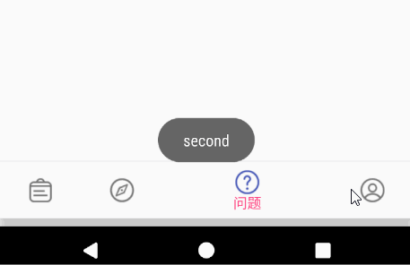
BottomNavigationView
参考:链接
BottomNavigationView是design包提供的底部导航栏,支持3~5个选项
menu文件(buttom.xml)
<?xml version="1.0" encoding="UTF-8" ?>
<menu xmlns:android="http://schemas.android.com/apk/res/android">
    <item android:id="@+id/first" android:icon="@drawable/my_class"
        android:title="课表" />

    <item android:id="@+id/second" android:icon="@drawable/find" android:title="发现"/>

    <item android:id="@+id/third" android:icon="@drawable/question" android:title="问题"/>

    <item android:title="个人" android:id="@+id/fourth" android:icon="@drawable/myself"/>
</menu>
布局文件
 <android.support.design.widget.BottomNavigationView
        android:id="@+id/bottom"
        android:layout_width="match_parent"
        android:layout_height="wrap_content"
        android:background="?android:attr/windowBackground"
        app:itemTextColor="@color/color"
        app:itemBackground="@drawable/ripple"
        app:menu="@menu/bottom"//引用menu文件
        />
BottomNavigationView提供的自定义的属性
itemIconTint 图标着色,图标选中/未选中时的颜色,也可以直接在menu中设置
itemTextColor 文字着色,选项文字选中/未选中时的颜色
itemBackground 波纹效果
color.xml(新建一个color文件夹,在其中新建color.xml)
<?xml version="1.0" encoding="utf-8"?>
<selector xmlns:android="http://schemas.android.com/apk/res/android">
    <item android:state_checked="true"
        android:color="@color/colorAccent"/>
    <item android:state_checked="false"
        android:color="@android:color/black"/>
</selector>
ripple.xml(drawable文件中)
注意这个只支持Android 5以上
<?xml version="1.0" encoding="utf-8"?>
<ripple xmlns:android="http://schemas.android.com/apk/res/android"
    android:color="@android:color/holo_red_light">
</ripple>
支持旧版本
<?xml version="1.0" encoding="utf-8"?>
<shape xmlns:android="http://schemas.android.com/apk/res/android"
    android:shape="rectangle">
    <solid android:color="@android:color/holo_red_light" />
</shape>
点击事件
//单击选项的事件
BottomNavigationView.setOnNavigationItemSelectedListener(item -> {
            switch (item.getItemId()){
                case R.id.first:
                    Toast.makeText(this, "first", Toast.LENGTH_SHORT).show();
                    break;
                case R.id.second:
                    Toast.makeText(this, "second", Toast.LENGTH_SHORT).show();
                    break;
                case R.id.third:
                    Toast.makeText(this, "third", Toast.LENGTH_SHORT).show();
                    break;
                case R.id.fourth:
                    Toast.makeText(this, "fourth", Toast.LENGTH_SHORT).show();
                    break;
            }
            return true;
        });
        //监听已选中的Item被重复点击的情况,如果设置了这个事件,则只会调用一次OnNavigationItemSelectedListener,比如我们可以使用一个OnNavigationItemReselectedListener的空实现来屏蔽item被重复点击的情况
        BottomNavigationView.setOnNavigationItemReselectedListener(item -> {});
通过代码的方式切换菜单选项
navigationView.setSelectedItemId(R.id.first);
效果图:(注意三个选项的效果和这个的不同)
禁用BottomNavigationView的动画效果
public class BottomNavigationViewHelper {
    private BottomNavigationView mMainBottomNavView;

    private BottomNavigationMenuView mMenuView;

    public BottomNavigationViewHelper(BottomNavigationView mainBottomNavView) {
        mMainBottomNavView = mainBottomNavView;
        mMenuView = getMenuView();
    }

    private BottomNavigationMenuView getMenuView() {
        Field field;
        try {
            field = mMainBottomNavView.getClass().getDeclaredField("mMenuView");
            field.setAccessible(true);
            return (BottomNavigationMenuView) field.get(mMainBottomNavView);
        } catch (NoSuchFieldException | IllegalAccessException e) {
            e.printStackTrace();
        }
        return null;
    }

    public void enableBottomNavAnim(boolean enable) {
        mMainBottomNavView.post(() -> enableBtNavAnimInternal(enable));
    }

    private void enableBtNavAnimInternal(boolean enable) {
        if (mMenuView == null) throw new RuntimeException("get mMenuView by reflect failed");
        if (!enable) {
            try {
                Field field1 = mMenuView.getClass().getDeclaredField("mShiftingMode");
                field1.setAccessible(true);
                field1.setBoolean(mMenuView, false);
                updateMenuView();
            } catch (IllegalAccessException | NoSuchFieldException e) {
                e.printStackTrace();
            }
        }
    }

    private void updateMenuView() {
        if (mMenuView == null) throw new RuntimeException("get mMenuView by reflect failed");
        try {
            Class<?> clazz = mMenuView.getClass();
            Method method = clazz.getDeclaredMethod("updateMenuView");
            method.invoke(mMenuView);
        } catch (IllegalAccessException | NoSuchMethodException | InvocationTargetException e) {
            e.printStackTrace();
        }
    }

    public void setBottomNavTextSize(int size) {
        mMainBottomNavView.post(() -> setBtNavTextSizeInternal(size));
    }

    private void setBtNavTextSizeInternal(int size) {
        if (mMenuView == null) throw new RuntimeException("get mMenuView by reflect failed");
        try {
            Field field = mMenuView.getClass().getDeclaredField("mButtons");
            field.setAccessible(true);
            BottomNavigationItemView[] buttons = (BottomNavigationItemView[]) field.get(mMenuView);
            for (BottomNavigationItemView view : buttons) {
                Class<?> clazz = view.getClass();
                Field largeLabelField = clazz.getDeclaredField("mLargeLabel");
                largeLabelField.setAccessible(true);
                TextView largeLabel = (TextView) largeLabelField.get(view);
                largeLabel.setTextSize(size);
                updateMenuView();
            }
        } catch (NoSuchFieldException | IllegalAccessException e) {
            e.printStackTrace();
        }
    }
}
使用
 BottomNavigationViewHelper btNavViewHelper = new BottomNavigationViewHelper(bottomNavigationView);
        btNavViewHelper.enableBottomNavAnim(false);
        btNavViewHelper.setBottomNavTextSize(10);
TextInputLayout
布局文件
<android.support.design.widget.TextInputLayout
        android:layout_width="match_parent"
        android:layout_height="wrap_content"
        android:id="@+id/textInputLayout"
        android:hint="姓名" //设置提示
        app:counterMaxLength="6" //最大的长度
        >
        <EditText
            android:layout_width="match_parent"
            android:layout_height="wrap_content" />
    </android.support.design.widget.TextInputLayout>

    <android.support.design.widget.TextInputLayout
        android:layout_width="match_parent"
        android:layout_height="wrap_content"
        android:id="@+id/textInputLayout1"
        android:hint="密码"
        app:counterMaxLength="6"
        app:errorEnabled="true"
        app:counterEnabled="true"   //设置是否显示长度
        app:passwordToggleEnabled="true" //设置 password 开关是否可用
        >
        <android.support.design.widget.TextInputEditText
            android:layout_width="match_parent"
            android:layout_height="wrap_content"
            android:inputType="numberPassword"
            />
    </android.support.design.widget.TextInputLayout>
代码
 textInputLayout=(TextInputLayout)findViewById(R.id.textInputLayout);
        EditText editText=textInputLayout.getEditText();
        editText.addTextChangedListener(new TextWatcher() {
            @Override
            public void beforeTextChanged(CharSequence s, int start, int count, int after) {

            }

            @Override
            public void onTextChanged(CharSequence s, int start, int before, int count) {

            }

            @Override
            public void afterTextChanged(Editable s) {
                if (editText.getText().length()>6){
                    textInputLayout.setErrorEnabled(true);
                    textInputLayout.setError("不能超过六个字符");
                }else {
                   textInputLayout.setErrorEnabled(false);
                }
            }
        });
BottomSheetDialog
参考 :www.jianshu.com/p/0a7383e0a…
public BottomSheetDialog showDialog(Context context,View view){
        BottomSheetDialog sheetDialog=new BottomSheetDialog(context);
        sheetDialog.setContentView(view);
        sheetDialog.show();//显示BottomSheetDialog
        return sheetDialog;
    }
注意:要使用BottomSheetDialog,其根布局必需是
CoordinatorLayout或NestedScrollView
例如
<android.support.v4.widget.NestedScrollView
    xmlns:android="http://schemas.android.com/apk/res/android"
    android:layout_width="match_parent"
    android:layout_height="match_parent">
        <LinearLayout
            android:layout_width="match_parent"
            android:layout_height="match_parent"
            android:orientation="vertical"
            >
                <include
                    layout="@layout/base_ok_and_cancel"
                    />
                <include
                    layout="@layout/dividing_line"
                    />
                <android.support.v7.widget.RecyclerView
                    android:id="@+id/recycler"
                    android:layout_width="match_parent"
                    android:layout_height="wrap_content" />
        </LinearLayout>
</android.support.v4.widget.NestedScrollView>
ViewPager
2018/6/4 参考链接:
tech.souyunku.com5a4c2f…
blog.csdn.net/lmj62356579…
- 常用方法
- setAdapter(PagerAdapter adapter) 设置适配器
- setOffscreenPageLimit(int limit) 设置缓存的页面个数,默认是 1
- setCurrentItem(int item,boolean smoothScroll) 第二个参数表示,点击TableLayout的Tab是移动过去(true),还是直接跳转(false),默认false
- setCurrentItem(int item) 跳转到特定的页面
- setOnPageChangeListener(..) 设置页面滑动时的监听器(现在API中建议使用 – addOnPageChangeListener(..))
- addOnPageChangeListener() 设置页面的监听
- setPageTransformer(..PageTransformer) 设置页面切换时的动画效果
- setPageMargin(int marginPixels) 设置不同页面之间的间隔
- setPageMarginDrawable(..) 设置不同页面间隔之间的装饰图也就是 divide ,要想显示设置的图片,需要同时设置 setPageMargin()
- PagerAdapter(不常用,主要用FragmentPagerAdapter,FragmentStatePagerAdapter)
public class MyAdapter extends PagerAdapter{
    List<View> list;

    public adapter_pager(List<View> list){
        this.list=list;
    }

    /**
     * 用来实例化页面
     * @param container
     * @param position
     * @return 要实例化的页面
     */
    @Override
    public Object instantiateItem(ViewGroup container, int position) {
        //往view group中加入指定的view,注意如果已经加载一个Fragment,再回到这个Fragment时,不会调用这个方法(两个Fragment相距不远时)
        container.addView(list.get(position));
        return list.get(position);
    }

    @Override
    public void destroyItem(ViewGroup container, int position, Object object) {
        //往view group中删除指定的view
        container.removeView(list.get(position));
    }

    /**
     *
     * @return view 的数目
     */
    @Override
    public int getCount() {
        return list.size();
    }

    /**
     * api上说写成 view==object的形式
     * @param view
     * @param object
     * @return
     */
    @Override
    public boolean isViewFromObject(View view, Object object) {
        return view==object;
    }

}
- FragmentPagerAdapter的使用
- 继承FragmentPagerAdapter,并重新它的方法
public class MyFragmentPagerAdapter extends FragmentPagerAdapter {

    private List<Fragment> lists;

    public MyFragmentPagerAdapter(FragmentManager fm,List<Fragment> lists) {
        super(fm);
        this.lists=lists;
    }

    @Override
    public Fragment getItem(int position) {//返回对应的Fragment实例(必须)
        return lists.get(position);
    }

    @Override
    public int getCount() {//返回页面的个数(必须)
        return lists.size();
    }

     @Override
      public CharSequence getPageTitle(int position) {//返回每个页面对应的标签
        return super.getPageTitle(position);
    }
}
- FragmentStatePagerAdapter的使用也和上面的FragmentPagerAdapter一样
FragmentStatePagerAdapter和FragmentPagerAdapter的区别:
FragmentPagerAdapter:对于不再需要的 fragment,选择调用 onDetach() 方法,仅销毁视图,并不会销毁 >fragment 实例,适用于比较少的页面
FragmentStatePagerAdapter:会销毁不再需要的 fragment,当当前事务提交以后,会彻底的将 fragmeng 从当前 Activity 的FragmentManager 中移除,销毁时,会将其保存起来信息,创建时重新加载(有父类自己完成)。适用于大量的页面
        pager=(ViewPager)findViewById(R.id.pager);
        pager.setAdapter(new MyFragmentStatePagerAdapter(getSupportFragmentManager());
- ViewPager与TableLayout联动
1、 第一步,初始化 TabLayout 和 ViewPager 后只要通过调用 TabLayout 的 tabLayout.setupWithViewPager(viewPager) 方法就将两者绑定在一起了
2、 重写 PagerAdapter 的 public CharSequence getPageTitle(int position) 方法,而 TabLayout 也正是通过 setupWithViewPager() 方法底部会调用 PagerAdapter 中的getPageTitle() 方法来实现联动的。
3、 设置addOnTabSelectedListener监听,在 onTabSelected 方法中调用ViewPager的setCurrentItem来更改页面
TabLayout.addOnTabSelectedListener(new TabLayout.OnTabSelectedListener() {
            @Override
            public void onTabSelected(TabLayout.Tab tab) {//点击tab和滑动时调用
                //切换viewPager
                pager.setCurrentItem(tab.getPosition(),true);

            }

            @Override
            public void onTabUnselected(TabLayout.Tab tab) {

            }

            @Override
            public void onTabReselected(TabLayout.Tab tab) {

            }
        });
- 设置标题和指示器
<android.support.v4.view.ViewPager
        android:id="@+id/pager"
        android:layout_width="match_parent"
        android:layout_height="match_parent">
        <LinearLayout                          //放入指示器的布局,由于不知道有多少个指示器,所以应该动态加入
            android:layout_width="match_parent"
            android:layout_height="wrap_content"/>
        <TextView                               //标题
            android:layout_width="match_parent"
            android:layout_height="wrap_content" />
    </android.support.v4.view.ViewPager>
要实现当页面滑动时,标题和指示器伴随改变,只需设置监听页面改变的方法 addOnPageChangeListener(),在onPageSelected中重新设置标题和指示器
- 自定义ViewPager的切换的效果
重写
ViewPager.PageTransformer接口,并实现方法
public class MyPageTransformer implements ViewPager.PageTransformer {
    @Override
    public void transformPage(@NonNull View page, float position) {
        if (position<-1){//页面位于屏幕的左侧

        }else if (position<=1){
            if (position<=0){//当前选中的界面,从0渐变到-1
                   page.setAlpha(1+position);
            }else {//后一个界面,从1渐变到0
                   page.setAlpha(1-position);
            }
        }else {//页面在屏幕的右侧

        }
    }
}

//设置PageTransformer
 pager.setPageTransformer(true,pageTransformer);
注意:
其实这里文档的描述并不是完全正确的,前后 item position 为 -1 和 1 的前提是你没有给 ViewPager 设置 pageMargin。
如果你设置了 pageMargin,前后 item 的 position 需要分别加上(或减去,前减后加)一个偏移量(偏移量的计算方式为 pageMargin / pageWidth)

在用户滑动界面的时候,position 是动态变化的,下面以左滑为例(以向左为正方向):

选中 item 的 position:从 0 渐至 -1 - offset (pageMargin / pageWidth)
前一个 item 的 position:从 -1 渐至 -1 - offset (pageMargin / pageWidth)
前两个 item 的 position:从 -2 渐至 -2 - offset (pageMargin / pageWidth),再往前就以此类推
后一个 item 的 position:从 1 + offset (pageMargin / pageWidth) 渐至 0,再往后就以此类推
ViewPager一屏显示多个页面
把ViewPager的父布局和本身的
android:clipChildren=设置为false,并设置ViewPager的左右的margin,最后调用pager.setPageMargin(20);,设置每个页面之间的间距,调用pager.setOffscreenPageLimit(3);设置缓存页面的个数
<android.support.constraint.ConstraintLayout xmlns:android="http://schemas.android.com/apk/res/android"
   ...
    android:clipChildren="false"
    >
<android.support.v4.view.ViewPager
    android:id="@+id/view"
    android:layout_width="match_parent"
    android:layout_height="200dp"
    android:clipChildren="false"
    android:layout_marginLeft="40dp"
    android:layout_marginRight="40dp"
    />
</android.support.constraint.ConstraintLayout>
PagerTabStrip与PagerTitleStrip添加标题栏
TabLayout
- TabLayout的属性
app:tabIndicatorColor :指示条的颜色
app:tabIndicatorHeight :指示条的高度
app:tabSelectedTextColor : tab被选中时的字体颜色
app:tabTextColor : tab未被选中时的字体颜色
app:tabMode=”scrollable” : 默认是fixed:固定的,标签很多时候会被挤压,不能滑动。
<android.support.design.widget.TabLayout
        android:id="@+id/tab"
        app:tabGravity="center"
        android:layout_width="match_parent"
        android:layout_height="wrap_content"
        app:tabIndicatorColor="#93BE47"
        app:tabIndicatorHeight="20sp"
        app:tabSelectedTextColor="#93BE47"
        app:tabTextColor="#B83E1F"
        />
- 隐藏指示条
设置指示条的高度为0:
app:tabIndicatorHeight=”0dp”
设置指示条的颜色为透明
app:tabIndicatorColor=”@android:color/transparent”
- TabItem
- 给TabLayout设置图片
 @Override   //在PagerAdapter的getPageTitle方法
public CharSequence getPageTitle(int position) {
                Drawable image = ContextCompat.getDrawable(MainActivity.this,R.drawable.picture);
                image.setBounds(0, 0, image.getIntrinsicWidth(), image.getIntrinsicHeight());
                SpannableString sb = new SpannableString(" ");
                ImageSpan imageSpan = new ImageSpan(image, ImageSpan.ALIGN_BOTTOM);
                sb.setSpan(imageSpan, 0, 1, Spannable.SPAN_EXCLUSIVE_EXCLUSIVE);
                return sb;
            }
- 给TabLayout设置数据
tabLayout.addTab(tabLayout.newTab().setText("C"));
tabLayout.addTab(tabLayout.newTab().setText("C++"));
tabLayout.addTab(tabLayout.newTab().setText("Java"));
- TabLayout与ViewPager实现联动
tabLayout.setupWithViewPager(viewPager);

//同时在Adapter中重写 getPageTitle 方法,不然TabLayout无法显示

    @Nullable
    @Override
    public CharSequence getPageTitle(int position) {
        if (position>=25)
            return "";
        return ScheduleFragment.weeks[position];
    }
- 设置
tabMode
app:tabMode="scrollable" //如果要显示的数据很多就需要使用这个属性,不然无法显示出标题
Tablayout 设置字体大小
官方的 TabLayout 没有提供修改 TextView size 的方法,可以新建一个 style CustomTabLayoutTextAppearance 继承 TextAppearance.AppCompat.Widget.ActionBar.Title.Inverse ,然后增加 item android:textSize 为你想设置的大小。
再在 TabLayout 的布局文件里设置 app:tabTextAppearance=”@style/CustomTabLayoutTextAppearance” 即可。
ToolBar的使用
- 参考链接
链接:
www.jianshu.com/p/e2ae6aaff…
www.jianshu.com/p/b770b2a1b…
- 简单的使用 1.在style.xml文件中更改parent为不带ActionBar的主题
<style name="AppTheme" parent="Theme.AppCompat.Light.NoActionBar">2.在布局文件中加入ToolBar
 <android.support.v7.widget.Toolbar
  android:id="@+id/testToolBar"
        android:layout_width="match_parent"
        android:layout_height="wrap_content"
        app:layout_constraintTop_toTopOf="parent"
        app:navigationIcon="@drawable/navigation"
        app:popupTheme="@style/AlertDialog.AppCompat.Light" //设置ToolBar中菜单的主题
        android:theme="@style/ToolBarTheme"  //设置ToolBar的主题
/>
3、在代码中用ToolBar代替ActionBar
Toolbar toolbar=(Toolbar)findViewById(R.id.testToolBar);
setSupportActionBar(toolbar);
- 特色用法
- 在布局文件中 注意:
开头是自定义命名空间
xmlns:toolbar="http://schemas.android.com/apk/res-auto", 而不是 android, 例如:使用android:navigationIcon这种事无效的,必须使用 toolbar:navigationIcon
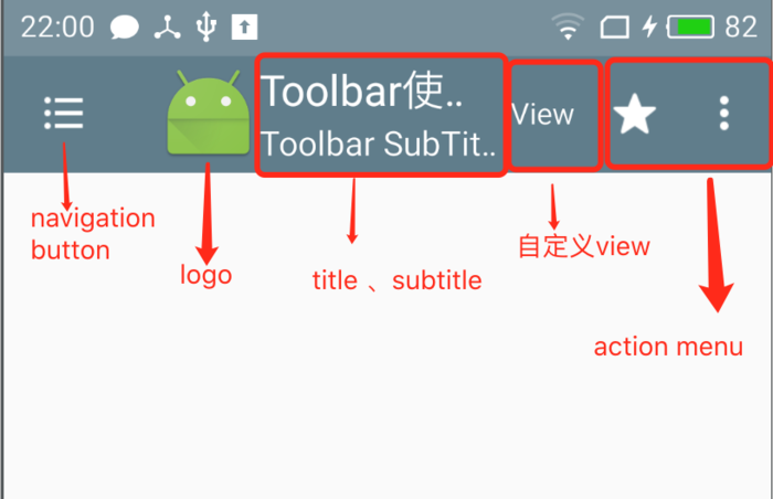
常见的toolbar的属性
toolbar:navigationIcon 设置navigation button toolbar:logo 设置logo 图标 toolbar:title 设置标题 toolbar:titleTextColor 设置标题文字颜色 toolbar:subtitle 设置副标题 toolbar:subtitleTextColor 设置副标题文字颜色 toolbar:popupTheme 设置Toolbar的菜单的主题样式 toolbar:titleTextAppearance 设置title text 相关属性,如:字体,颜色,大小等等 toolbar:subtitleTextAppearance 设置subtitle text 相关属性,如:字体,颜色,大小等等 toolbar:logoDescription logo 描述 android:background Toolbar 背景 android:theme 主题
- 在代码中设置
注意这里是直接使用Toolbar,没有调用setSupportActionBar(toolbar);方法,所以这里并没有取代 Actionbar,只是作为一个普通的控件
//设置NavigationIcon
 toolbar.setNavigationIcon(R.drawable.ic_book_list);
// 设置navigation button 点击事件
toolbar.setNavigationOnClickListener(new View.OnClickListener()
{
@Override public void onClick(View v)
{ finish();
} });
// 设置 toolbar 背景色
toolbar.setBackgroundColor(getResources().getColor(R.color.colorPrimary));
 // 设置标题
toolbar.setTitle(R.string.toolbar_title);
// 设置Toolbar 标题文字颜色
toolbar.setTitleTextColor(getResources().getColor(R.color.white));
// 设置Toolbar subTitle
toolbar.setSubtitle(R.string.sub_title);
// 设置Toolbar subTitle的字体颜色
toolbar.setSubtitleTextColor(getResources().getColor(R.color.white));
 // 设置logo
toolbar.setLogo(R.mipmap.ic_launcher);
// 设置 NavigationIcon 点击事件
toolbar.setNavigationOnClickListener(new View.OnClickListener() {
@Override public void onClick(View v)
{ finish();
} });
 //设置 Toolbar menu
 toolbar.inflateMenu(R.menu.setting_menu);
 // 设置溢出菜单的图标
toolbar.setOverflowIcon(getResources().getDrawable(R.drawable.abc_ic_menu_moreoverflow_mtrl_alpha));
// 设置menu item 点击事件
 toolbar.setOnMenuItemClickListener(new Toolbar.OnMenuItemClickListener() {
    @Override public boolean onMenuItemClick(MenuItem item) {
switch (item.getItemId(){
   case R.id.item_setting:
    //点击设置
      break;
}
 return false;
}
});
调用setSupportActionBar(toolbar);方法时的处理方法,跟上面有所不同
    final Toolbar toolbar=(Toolbar)findViewById(R.id.testToolBar);
        //添加menu  在这里是无效的
        //toolbar.inflateMenu(R.menu.sub);
        //为菜单添加点击事件  在这里是无效的
        toolbar.setOnMenuItemClickListener(new Toolbar.OnMenuItemClickListener() {
            @Override
            public boolean onMenuItemClick(MenuItem item) {
                switch (item.getItemId()){
                    case R.id.build:

                        Toast.makeText(ToolBarActivity.this, "建立", Toast.LENGTH_SHORT).show();
                        break;
                    case R.id.edit:
                        Toast.makeText(ToolBarActivity.this, "编辑", Toast.LENGTH_SHORT).show();
                        break;
                    case R.id.add:
                        Toast.makeText(ToolBarActivity.this, "增加", Toast.LENGTH_SHORT).show();
                        break;
                    case R.id.delete:
                        Toast.makeText(ToolBarActivity.this, "删除", Toast.LENGTH_SHORT).show();
                        break;
                }
                return true;
            }

        });
// 设置 toolbar 背景色
toolbar.setBackgroundColor(getResources().getColor(R.color.colorPrimary));
 // 设置标题
toolbar.setTitle(R.string.toolbar_title);
// 设置Toolbar 标题文字颜色
toolbar.setTitleTextColor(getResources().getColor(R.color.white));
// 设置Toolbar subTitle
toolbar.setSubtitle(R.string.sub_title);
// 设置Toolbar subTitle的字体颜色
toolbar.setSubtitleTextColor(getResources().getColor(R.color.white));
 // 设置logo
toolbar.setLogo(R.mipmap.ic_launcher);
        setSupportActionBar(toolbar);
        //注意 ,这个方法一定要放在setSupportActionBar(toolbar);后面,不然接收不到回掉事件
        toolbar.setNavigationOnClickListener(new View.OnClickListener() {
            @Override
            public void onClick(View view) {
                Toast.makeText(ToolBarActivity.this, "导航栏启动", Toast.LENGTH_SHORT).show();
            }
        });

    ActionBar bar=getSupportActionBar();//获取ActionBar的实例,具体由Toolbar实现

   //由于Toolbar取代里Actionbar,所以可以调用这个方法来设置Menu
   @Override
   public boolean onCreateOptionsMenu(Menu menu)
   {
    getMenuInflater().inflate(R.menu.sub,menu);
      return  true;
}
- 更改menu文字的颜色和文字的大小 只要为Toolbar设置主题就行
<style name="ToolbarTheme" parent="Theme.AppCompat.Light">
 <!-- 更换Toolbar menu icon -->
<item name="actionOverflowButtonStyle">@style/OverFlowIcon</item>
<!-- 设置 toolbar menu的文字的颜色 -->
<item name="android:textColor">@android:color/holo_red_dark</item>

<!-- 设置 显示在toobar上菜单文字的颜色,注意这里没有 android:  -->
 <item name="actionMenuTextColor">@android:color/white</item>

<!-- 设置toolbar 的字体大小和menu文字大小-->
 <item name="android:textSize">15sp</item>

 </style> <style name="OverFlowIcon" parent="Widget.AppCompat.ActionButton.Overflow">
<item name="android:src">@drawable/abc_ic_menu_moreoverflow_mtrl_alpha</item>
 </style>
- 往Toolbar中添加View
  <android.support.v7.widget.Toolbar
        android:id="@+id/testToolBar"
        android:layout_width="match_parent"
        android:layout_height="wrap_content"
        app:layout_constraintTop_toTopOf="parent"
        app:navigationIcon="@drawable/navigation"
        app:popupTheme="@style/AlertDialog.AppCompat.Light" //设置ToolBar中菜单的主题
        android:theme="@style/ToolBarTheme"  //设置ToolBar的主题

          <EditText
            android:layout_width="match_parent"
            android:layout_height="wrap_content" />
</android.support.v7.widget.Toolbar>
在Fragment中获取Toolbar
- 方式1,获取Activity中的Toolbar
mainActivity=(MainActivity)getActivity();
        toolbar=mainActivity.findViewById(R.id.toolBar);
- 方式2,在Fragment中添加独立的Toolbar
((AppCompatActivity)getActivity()).setSupportActionBar((Toolbar) mContentView.findViewById(R.id.tb_toolbar));
注意:如果以方式1来设置标题,则应该在Activity中调用
setSupportActionBar(toolbar);
//注意这个方法应该在setSupportActionBar(toolbar);方法之后,不然getSupportActionBar()会返回null
getSupportActionBar().setDisplayShowTitleEnabled(false);
来消除ActionBar的标题。
使Toolbar中的标题居中
在布局文件中给Toolbar放置一个TextView
 <android.support.v7.widget.Toolbar
        android:id="@+id/toolBar"
        android:layout_width="match_parent"
        android:layout_height="wrap_content"
        android:background="?attr/colorPrimary"
        android:minHeight="?attr/actionBarSize"
        app:theme="@style/ThemeOverlay.AppCompat.Dark.ActionBar"
        >
        <TextView
            android:id="@+id/text"
            android:gravity="center"
            android:layout_gravity="center"
            android:layout_width="wrap_content"
            android:layout_height="match_parent"
            style="@style/TextAppearance.AppCompat.Widget.ActionBar.Title"//使用与Toolbar相同的字体样式
            />
    </android.support.v7.widget.Toolbar>
去除Toolbar自有的Title,在布局中使用app:title=””是不会起作用的,会显示ActionBar的标题,所以在代码中隐藏ActionBar的标题即可:
getSupportActionBar().setDisplayShowTitleEnabled(false);