Mint-ui 是个非常不错的 UI 框架,提供了很多组件。
但在项目中实际使用的时候,还需要将几个组件组合起来使用。
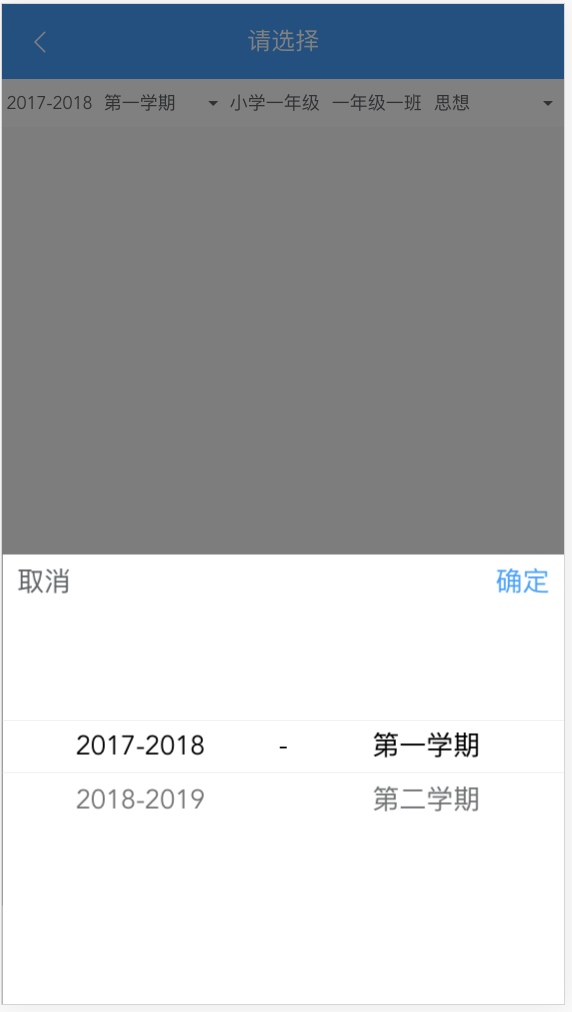
比如要实现 App 中常见的滚轮选择器,需要将 Popup 和 Picker 组合起来,并根据项目的 UI 效果做一定的定制。
下面将用 Popup + Picker 定制一个带确定取消按钮的滚轮选择器。
封装
布局很简单,外层套一个 <mt-popup>,上面是两个按钮,下面是 <mt-picker>。
这两个组件的具体用法请查阅 官方文档
先贴出代码
<template>
  <mt-popup
      class="mt-popup"
      v-model="visible.show"
      :closeOnClickModal="false"
      position="bottom">
    <div class="popup-container">
      <div class="title">
        <div class="text" @click="cancel()">取消</div>
        <div class="text confirm" @click="confirm()">确定</div>
      </div>
      <mt-picker ref="picker" class="mt-picker" value-key="name" :slots="slots" @change="onChange"></mt-picker>
    </div>
  </mt-popup>
</template>

<script>
  export default {
    components: {},
    props: {
      slots: {
        type: Array,
        required: true
      },
      visible: {
        // type: Object,
        required: true
      }
    },
    methods: {

      //滚轮变化回调
      onChange(picker, values) {
        // console.log(values)
      },

      //取消按钮
      cancel() {
        this.visible.show = false
      },

      //确定按钮
      confirm() {
        this.visible.show = false;
        let values = this.$refs.picker.getValues();
        //给父组件传值
        this.$emit("values", values);
      }
    }
  }
</script>

<style scoped lang="scss">

  @import "../../public/css/index";
  .mt-popup {
    width: 100%;
    height: 45%;
    .popup-container {
      width: 100%;
      height: 100%;
      background-color: white;
      .title {
        display: flex;
        justify-content: space-between;
        .text {
          font-size: $font-size-large;
          padding: 10px;
          color: $text-normal;
          &.confirm {
            color: $color-primary;
          }
        }
      }
      .mt-picker {
      }
    }
  }
</style>
使用
使用组件需要三步
1、 引入(路径需根据实际情况更改)
import SyPicker from '../components/SyPicker'
2、 在 components 里注册
    components: {
        'sy-picker': SyPicker
    }
3、 布局中使用
<sy-picker :slots="slots" :visible="yearTermShow" @values="onReceiveYearTermValues"></sy-picker>
去除无关代码,只保留跟本文相关的代码如下
<template>
  <div class="select-picker">
    <div @click="showYearTermPopup">弹出选择器</div>
    <sy-picker :slots="slots" :visible="yearTermShow" @values="onReceiveYearTermValues"></sy-picker>
  </div>
</template>

<script>
  import SyPicker from '../components/SyPicker'

  export default {
    components: {
      'sy-picker': SyPicker
    },
    created() {},
    data() {
      return {
        yearTermShow: {show: false},
        slots: [
          {
            flex: 1,
            values: [{id: '2017-2018', name: '2017-2018'},{id: '2018-2019', name: '2018-2019'}],
            className: 'slot1',
            textAlign: 'center'
          }, {
            divider: true,
            content: '-',
            className: 'slot2'
          }, {
            flex: 1,
            values: [{id: '1', name: '第一学期'}, {id: '2', name: '第三学期'}],
            className: 'slot3',
            textAlign: 'center'
          }
        ]
      }
    },
    computed: {},
    methods: {
      //显示滚轮选择器
      showYearTermPopup() {
        this.yearTermShow.show = true;
      },

      //点击确定之后接收选择的值
      onReceiveYearTermValues(values) {
        console.log("receive", values);
        this.selectYear = values[0];
        this.selectTerm = values[1];
      }
    }
  }
</script>

<style scoped lang="scss">
</style>
使用须知
1、 slots 传递的值与 mint-ui 中 picker 定义的 slots 一致,详情见 mint-ui.github.io/docs/#/zh-c… 。
备选值即 values 字段的值要统一转换成 `{id: 'xxx', name: 'xxx'}` 的格式,方便取 id 和显示。
2、 :visible="" 要传一个对象,因为 vue 规定在子组件中不能更改 props 的值,这里取个巧,传对象的话引用不变,但值可以改,不会报错。当然也可以用 vuex 来实现,哪个顺手用哪个吧。
3、 @values 接收的是选中的值的数组。不管滑动滚轮了没有,点击确定按钮时都会将当前滚轮选中的值传递过来。