一、前言
最近开发项目需要用到评论模块,参考了多家平台,对比之后觉得简书的最漂亮,就它了。
前端当然要先放图
简书原图
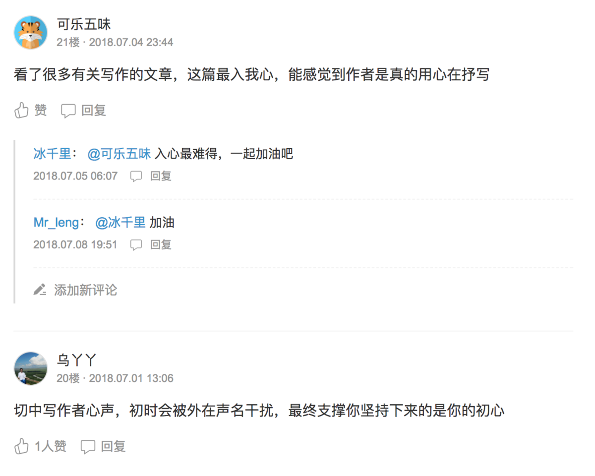
注意评论的输入框默认是隐藏的,点击回复才会显示出来
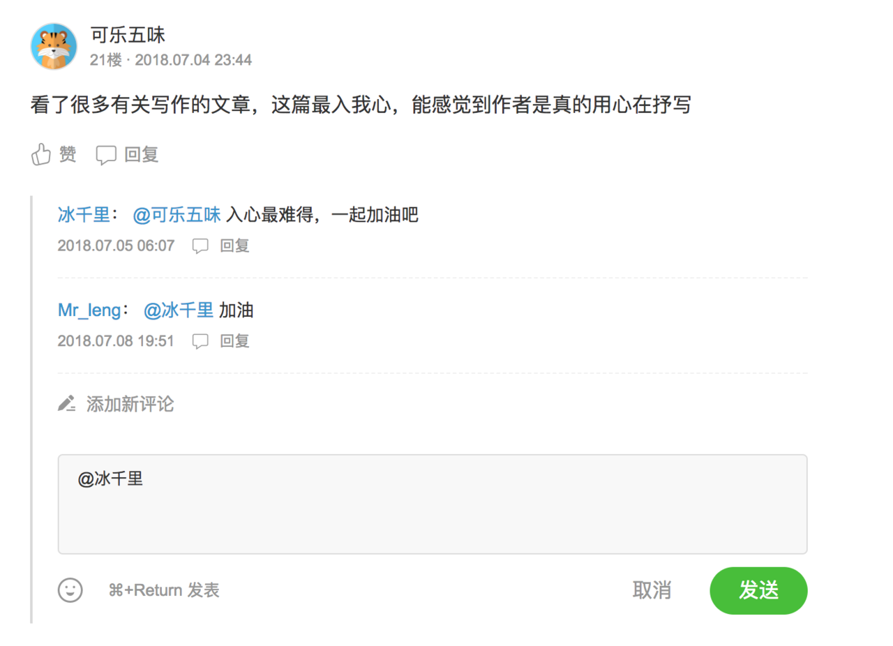
本篇文章实现的效果
同样输入框需要点击回复才会显示
二、功能分析
从 UI 上看,整个评论模块大致分为四个版块
1、 评论人信息。包括头像,昵称,评论时间
2、 评论的内容。包括文字内容,赞的个数和回复按钮
3、 他人的回复。回复可能有多条,所以这是个v-for循环。回复包括回复人及被回复人的昵称,回复内容,时间,以及回复按钮
4、 评论输入框。输入框最开始是隐藏的,点击回复按钮或添加新评论时才会显示,点取消隐藏。
回复功能可以回复当前评论本身,也可以回复其他用户对这条评论的评论,我们称之为子评论。所有子评论都挂载最初的父评论下。
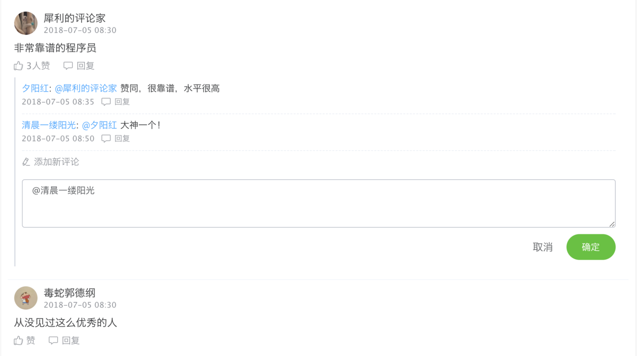
当点击子评论的回复按钮时,输入框弹出的同时会自动填上 @ + 被回复者的昵称,使逻辑更加合理。
点击添加新评论是添加对本条评论的子评论,不是对文章的新评论,所以文章末尾处应该还有一个输入框,用来发表新评论。
三、数据结构设计
参照的效果图有了,接下来就是设计数据了。数据库设计就不在这里说了,本项目把评论模块分了两张表,分别存放评论和回复。新建一个 mockdata.js 文件,模拟服务器返回的数据
//模拟评论数据
const comment = {
status: "成功",
code: 200,
data: [
{
id: 'comment0001', //主键id
date: '2018-07-05 08:30', //评论时间
ownerId: 'talents100020', //文章的id
fromId: 'errhefe232213', //评论者id
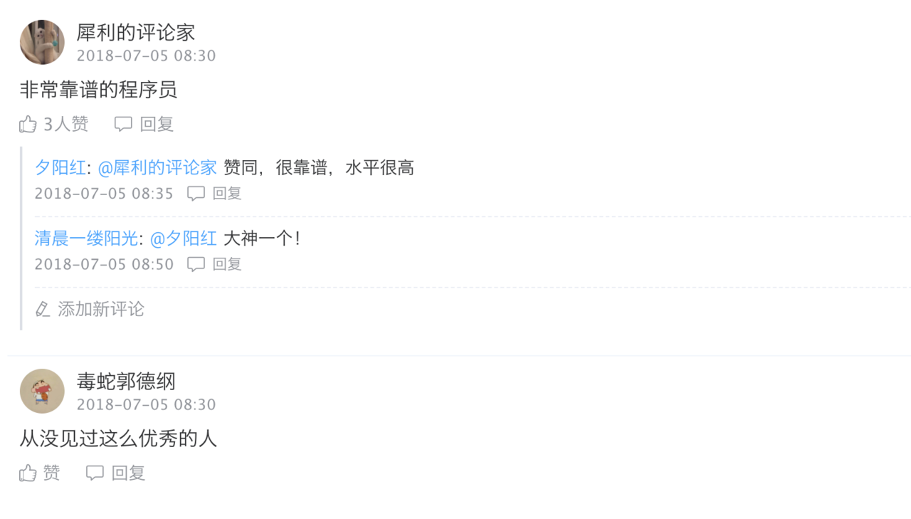
fromName: '犀利的评论家', //评论者昵称
fromAvatar: 'http://ww4.sinaimg.cn/bmiddle/006DLFVFgy1ft0j2pddjuj30v90uvagf.jpg', //评论者头像
likeNum: 3, //点赞人数
content: '非常靠谱的程序员', //评论内容
reply: [ //回复,或子评论
{
id: '34523244545', //主键id
commentId: 'comment0001', //父评论id,即父亲的id
fromId: 'observer223432', //评论者id
fromName: '夕阳红', //评论者昵称
fromAvatar: 'https://wx4.sinaimg.cn/mw690/69e273f8gy1ft1541dmb7j215o0qv7wh.jpg', //评论者头像
toId: 'errhefe232213', //被评论者id
toName: '犀利的评论家', //被评论者昵称
toAvatar: 'http://ww4.sinaimg.cn/bmiddle/006DLFVFgy1ft0j2pddjuj30v90uvagf.jpg', //被评论者头像
content: '赞同,很靠谱,水平很高', //评论内容
date: '2018-07-05 08:35' //评论时间
},
{
id: '34523244545',
commentId: 'comment0001',
fromId: 'observer567422',
fromName: '清晨一缕阳光',
fromAvatar: 'http://imgsrc.baidu.com/imgad/pic/item/c2fdfc039245d688fcba1b80aec27d1ed21b245d.jpg',
toId: 'observer223432',
toName: '夕阳红',
toAvatar: 'https://wx4.sinaimg.cn/mw690/69e273f8gy1ft1541dmb7j215o0qv7wh.jpg',
content: '大神一个!',
date: '2018-07-05 08:50'
}
]
},
{
id: 'comment0002',
date: '2018-07-05 08:30',
ownerId: 'talents100020',
fromId: 'errhefe232213',
fromName: '毒蛇郭德纲',
fromAvatar: 'http://ww1.sinaimg.cn/bmiddle/006DLFVFgy1ft0j2q2p8pj30v90uzmzz.jpg',
likeNum: 0,
content: '从没见过这么优秀的人',
reply: []
}
]
};
export {comment}
数据包裹在 data 中,评论可能有多条所以 data 是一个数组。每个字段的含义备注里写的很清楚了,不再过多解释。
所有关于母评论的子评论都挂载在母评论的 reply 字段下。
四、代码封装
新建 comment.vue 作为评论组件
<!--评论模块-->
<template>
  <div class="container">
    <div class="comment" v-for="item in comments">
      <div class="info">
        <img class="avatar" :src="item.fromAvatar" width="36" height="36"/>
        <div class="right">
          <div class="name">{{item.fromName}}</div>
          <div class="date">{{item.date}}</div>
        </div>
      </div>
      <div class="content">{{item.content}}</div>
      <div class="control">
        <span class="like" :class="{active: item.isLike}" @click="likeClick(item)">
          <i class="iconfont icon-like"></i>
          <span class="like-num">{{item.likeNum > 0 ? item.likeNum + '人赞' : '赞'}}</span>
        </span>
        <span class="comment-reply" @click="showCommentInput(item)">
          <i class="iconfont icon-comment"></i>
          <span>回复</span>
        </span>
      </div>
      <div class="reply">
        <div class="item" v-for="reply in item.reply">
          <div class="reply-content">
            <span class="from-name">{{reply.fromName}}</span><span>: </span>
            <span class="to-name">@{{reply.toName}}</span>
            <span>{{reply.content}}</span>
          </div>
          <div class="reply-bottom">
            <span>{{reply.date}}</span>
            <span class="reply-text" @click="showCommentInput(item, reply)">
              <i class="iconfont icon-comment"></i>
              <span>回复</span>
            </span>
          </div>
        </div>
        <div class="write-reply" v-if="item.reply.length > 0" @click="showCommentInput(item)">
          <i class="el-icon-edit"></i>
          <span class="add-comment">添加新评论</span>
        </div>
        <transition name="fade">
          <div class="input-wrapper" v-if="showItemId === item.id">
            <el-input class="gray-bg-input"
                      v-model="inputComment"
                      type="textarea"
                      :rows="3"
                      autofocus
                      placeholder="写下你的评论">
            </el-input>
            <div class="btn-control">
              <span class="cancel" @click="cancel">取消</span>
              <el-button class="btn" type="success" round @click="commitComment">确定</el-button>
            </div>
          </div>
        </transition>
      </div>
    </div>
  </div>
</template>

<script>

  import Vue from 'vue'

  export default {
    props: {
      comments: {
        type: Array,
        required: true
      }
    },
    components: {},
    data() {
      return {
        inputComment: '',
        showItemId: ''
      }
    },
    computed: {},
    methods: {
      /**
       * 点赞
       */
      likeClick(item) {
        if (item.isLike === null) {
          Vue.$set(item, "isLike", true);
          item.likeNum++
        } else {
          if (item.isLike) {
            item.likeNum--
          } else {
            item.likeNum++
          }
          item.isLike = !item.isLike;
        }
      },

      /**
       * 点击取消按钮
       */
      cancel() {
        this.showItemId = ''
      },

      /**
       * 提交评论
       */
      commitComment() {
        console.log(this.inputComment);
      },

      /**
       * 点击评论按钮显示输入框
       * item: 当前大评论
       * reply: 当前回复的评论
       */
      showCommentInput(item, reply) {
        if (reply) {
          this.inputComment = "@" + reply.fromName + " "
        } else {
          this.inputComment = ''
        }
        this.showItemId = item.id
      }
    },
    created() {
      console.log(this.comments)
    }
  }
</script>

<style scoped lang="scss">

  @import "../../public/scss/index";

  .container {
    padding: 0 10px;
    box-sizing: border-box;
    .comment {
      display: flex;
      flex-direction: column;
      padding: 10px;
      border-bottom: 1px solid $border-fourth;
      .info {
        display: flex;
        align-items: center;
        .avatar {
          border-radius: 50%;
        }
        .right {
          display: flex;
          flex-direction: column;
          margin-left: 10px;
          .name {
            font-size: 16px;
            color: $text-main;
            margin-bottom: 5px;
            font-weight: 500;
          }
          .date {
            font-size: 12px;
            color: $text-minor;
          }
        }
      }
      .content {
        font-size: 16px;
        color: $text-main;
        line-height: 20px;
        padding: 10px 0;
      }
      .control {
        display: flex;
        align-items: center;
        font-size: 14px;
        color: $text-minor;
        .like {
          display: flex;
          align-items: center;
          margin-right: 20px;
          cursor: pointer;
          &.active, &:hover {
            color: $color-main;
          }
          .iconfont {
            font-size: 14px;
            margin-right: 5px;
          }
        }
        .comment-reply {
          display: flex;
          align-items: center;
          cursor: pointer;
          &:hover {
            color: $text-333;
          }
          .iconfont {
            font-size: 16px;
            margin-right: 5px;
          }
        }

      }
      .reply {
        margin: 10px 0;
        border-left: 2px solid $border-first;
        .item {
          margin: 0 10px;
          padding: 10px 0;
          border-bottom: 1px dashed $border-third;
          .reply-content {
            display: flex;
            align-items: center;
            font-size: 14px;
            color: $text-main;
            .from-name {
              color: $color-main;
            }
            .to-name {
              color: $color-main;
              margin-left: 5px;
              margin-right: 5px;
            }
          }
          .reply-bottom {
            display: flex;
            align-items: center;
            margin-top: 6px;
            font-size: 12px;
            color: $text-minor;
            .reply-text {
              display: flex;
              align-items: center;
              margin-left: 10px;
              cursor: pointer;
              &:hover {
                color: $text-333;
              }
              .icon-comment {
                margin-right: 5px;
              }
            }
          }
        }
        .write-reply {
          display: flex;
          align-items: center;
          font-size: 14px;
          color: $text-minor;
          padding: 10px;
          cursor: pointer;
          &:hover {
            color: $text-main;
          }
          .el-icon-edit {
            margin-right: 5px;
          }
        }
        .fade-enter-active, fade-leave-active {
          transition: opacity 0.5s;
        }
        .fade-enter, .fade-leave-to {
          opacity: 0;
        }
        .input-wrapper {
          padding: 10px;
          .gray-bg-input, .el-input__inner {
            /*background-color: #67C23A;*/
          }
          .btn-control {
            display: flex;
            justify-content: flex-end;
            align-items: center;
            padding-top: 10px;
            .cancel {
              font-size: 16px;
              color: $text-normal;
              margin-right: 20px;
              cursor: pointer;
              &:hover {
                color: $text-333;
              }
            }
            .confirm {
              font-size: 16px;
            }
          }
        }
      }
    }
  }
</style>
数据由使用的时候通过 comments 使用 props 传入。
布局用到了 Element-ui 的一些组件,组件的属性和方法请查看官方文档。
css 用了预处理器 SASS/SCSS 编写,$开头的为 SCSS 的变量,所有的颜色都放在了一个文件下,便于日后维护修改
$color-main: #409EFF;
$color-success: #67C23A;
$color-warning: #E6A23C;
$color-danger: #F56C6C;
$color-info: #909399;

$text-main: #303133;
$text-normal: #606266;
$text-minor: #909399;  //次要文字
$text-placeholder: #C0C4CC;
$text-333: #333;

$border-first: #DCDFE6;
$border-second: #E4E7ED;
$border-third: #EBEEF5;
$border-fourth: #F2F6FC;

$content-bg-color: #fff
五、使用
封装完之后,就可以愉快的使用啦!
在需要使用的文件里,先将第三步模拟好的数据导入进来,再引入 comment 组件,再将模拟的数据赋值给组件的 :comments 属性。
只留下核心代码,则使用方法如下:
<template>
  <comment :comments="commentData"></comment>
</template>

<script>
  import * as CommentData from '../mockdata'
  import comment from '../components/Comment'

  export default {
    components: {
      comment
    },
    data() {
      return {
        commentData: []
      }
    },
    created() {
      this.commentData = CommentData.comment.data;
    },
  }
<script>
以上就是仿简书的评论模块,功能很简单,就是布局稍微有点复杂。
欢迎大家交流分享~